Category: Visual Data
-

Best Things This Year (2025)
—
by
in Books, Business, Computers, Family, Movies, Music, Personal, Site Updates, Television, The Web, Travel, Visual Data, WorkThey say don’t meet your heroes and I didn’t but I got to see David Lynch in person just once. It was 2014. I got dressed that morning and put on a suit and went to my very-not-suit-wearing-startup-office at Broad and Chestnut and had to explain to everyone I was going to see David Lynch…
-

Schmedium Data: Building little data pipelines with bash
Over at plotdevice.bengarvey.com I have a bunch of one-off dataviz projects, experiments, and analyses. They all run on data, but sometimes it’s not easy to get, so I end up trimming and transforming data into something I can work with. We’re not talking about big data here, more like small or medium data. Schmedium data.…
-

Best Things this Year (2017)
Every year I write a recap of things I did and enjoyed. 2017 was packed. I re-read my 2016 recap and there’s a lot of despair, but I’m glad it didn’t slow me down. Maybe it was motivating. TV / Movies Twin Peaks: The Return Silicon Valley The Leftovers The Big Sick Coco Get Out…
-
15 things I’m doing after OpenVisConf 2017
Today was the last day of the incredible OpenVisConf in Boston. I’m still digesting everything from the two days of talks, but here is my general plan. 1. Taking screenshots of my work in progress. So many of the talks had in-progress shots that showed their design and thought process and it made everything easier…
-
Presentation on Data Expression
Here’s a link to the presentation I gave on October 30th at the Digital Analytics Association Symposium on Data Visualization and Expression. It’s improved since I gave my first talk on the subject at IgnitePhilly 11. One of my goals this year was to do more public speaking at bigger events. I’m glad I did…
-
2014 Digital Analytics Association Talk on October 30th
I’m excited to be giving a talk on Data Expression at this year’s Digital Analytics Symposium in Philadelphia. Some information about the event: Thursday, October 30, 2014 12:30pm – 6:30pm University of Pennsylvania Houston Hall 3417 Spruce Street Philadelphia, PA 19104-6306 Digital Analytics – Art, Science or Both? Stitching together the infrastructure, systems, methods and…
-
VizWar @ Philly Tech Week 2014
Fellow RJMetrician Austin Lopez and I competed in a data visualization contest/hackathon called VizWars at WHYY last night. It was hosted by Acumen Analytics and Tableau. The goal was to come up with the best visualization from either NCAA Basketball tournament statistics or Earthquake data they provided. This is what we came up with. The…
-
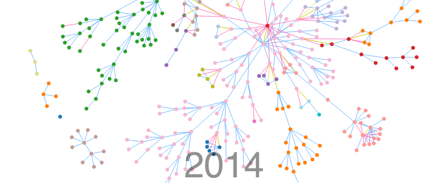
Announcing Lineage: A Family Tree Data Expression Engine
Last week at the Philly JS Dev meetup, I demoed a new project I’ve been working on called Lineage. It all started as a way to try and visualize all the research my Aunt Peggy has done over the last 50 years. Using D3, I was able to build a way to search, filter and…
-
Best Things This Year (2013)
Anecdotally, it seems like a lot of people shook up their lives in 2013. I certainly did. Here are the best things that happened to me in 2013. 1. RJMetrics – In March I started working at RJMetrics, an e-commerce data analytics firm in center city Philadelphia. Leaving Garvey Corp was a difficult decision, but…
-
D3.js Talk at Philly JS Meetup
I’m going to give a talk titled Data Expression with D3 and Null Family Values at the Philly Javascript Dev meetup on January, 22. I’ll also be giving a demonstration of an awesome D3 project I’ve been working on. Here’s a sneak peak:
-
My Ignite Philly 11 Presentation on Data Visualization
Update: Here’s the video of my presentation Last Thursday I gave a talk on Data Visualization at Ignite Philly 11. I was nervous as hell, but the encouragement you get from that crowd is amazing. The organizers (David, Geoff and Adam) did a great job and it could not have gone smoother. Here are my…
-
Media Roundup for Mandel Bulldog Budget
The reaction to the Mandel for Controller Bulldog Budget has been amazing! Here’s a list of all the places it was mentioned online. Technically Philly – “Use the coolest, most comprehensive City of Philadelphia budget visualization you’ve ever seen” Made it to story #4 on Hacker News with over 60 comments Tons of activity on…
-
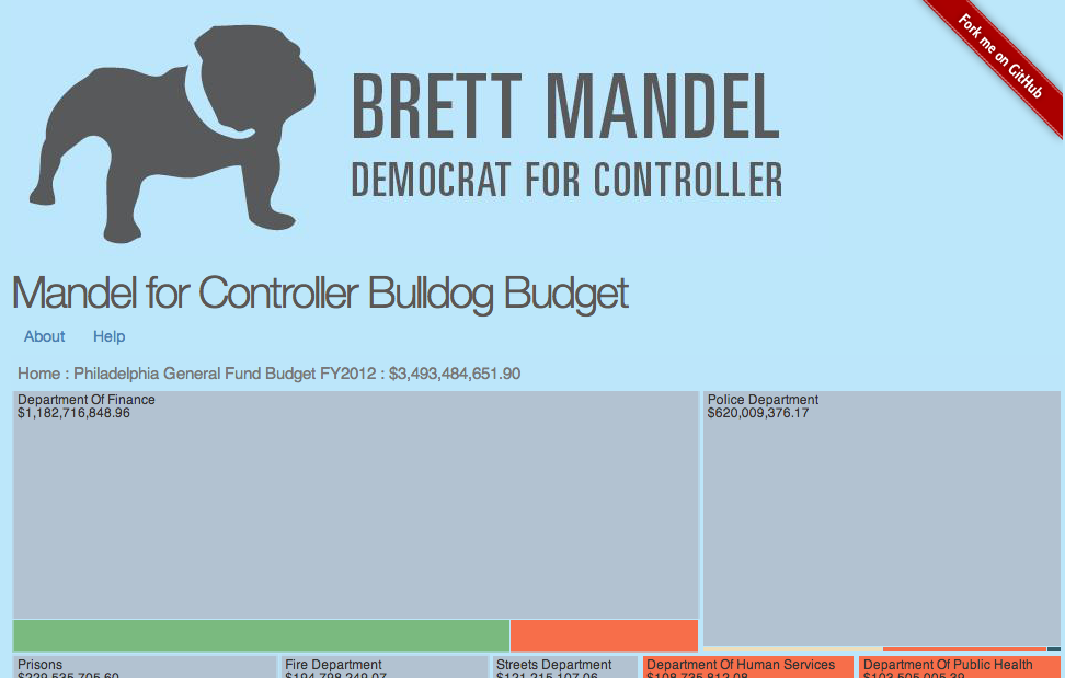
Philadelphia Budget Data Visualized
For the past few months I’ve been working with Brett Mandel on creating a data visualization of Philadelphia’s General budget. We used a treepmap from D3 to show expenditures categorized by department, but lets you drill down to al 217,450 expenditures. We’re launching it today, so check it out and see what you…
-
Sparklines in HTML5
I wrote some code to make Sparklines in HTML5, but it was too tied to what I was working on. Tonight I broke it out on its own as a generic javascript function. Check it out. Read more about Sparklines.
-
Tufte Course Review and Notes
Yesterday I attended Ed Tufte’s one day course on Presenting Data and Information. His book, The Visual Display of Quantitative Information, completely changed the way I think about data. If you love his book, I highly recommend his course. He doesn’t cover a lot of new ground, but he puts emphasis on a few things…