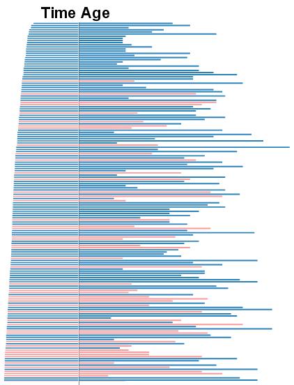
This graph shows and is sorted by the relative times for each runner on the left, their relative age on the right, and their gender by color. It seems to show that on average, men ran the race faster than women.
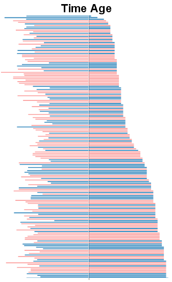
This graph below is the same data, but sorted by the participants’ age.

Image 2 shows the distribution of racers with a sharp increase about 1/4 of the way up. ? ?I think the 1 year old is a typo. ?haha. ?It also shows a big cluster of 12-14 year old girls. ?I couldn’t figure out a way to show what town they were from, but that would be interesting to analyze, too. Big thanks to Sparklines for Excel for the AddIn that helped me make these images.
Update: ?I fixed the problems I had with the previous images. ?These should reflect the actual data.
Comments
5 responses to “5K Results Reimagined”
That’s cool Ben.
Did you draw any conclusion ? Visually, overall seems to me that age is not the key factor, although 50% of top racers are in the first age quartile.
Also the oldest racer is making a pretty decent time, in the top 25% racers.
Seems to have less dispersion among women age ?
maybe boxplot, Stipechart and spreadchart can help analyse those parameters.
Can you add an age scale.
Great job indeed Ben !! Thanks a lot for sharing.
Ben, which SfE function did you use ? Any spreadchart w/ 2 series or barchart ?
Thanks. I’ll make some additions like the age scale and try to use some of the other charts.
I used two sets of bar charts, but the one on the left was set to a negative number.
Hah. I went to play around with the data a little more tonight and I realize the datasheet was totally screwed up. I’m going to have to fix the data and redo the graphics.
The pics are now fixed.